
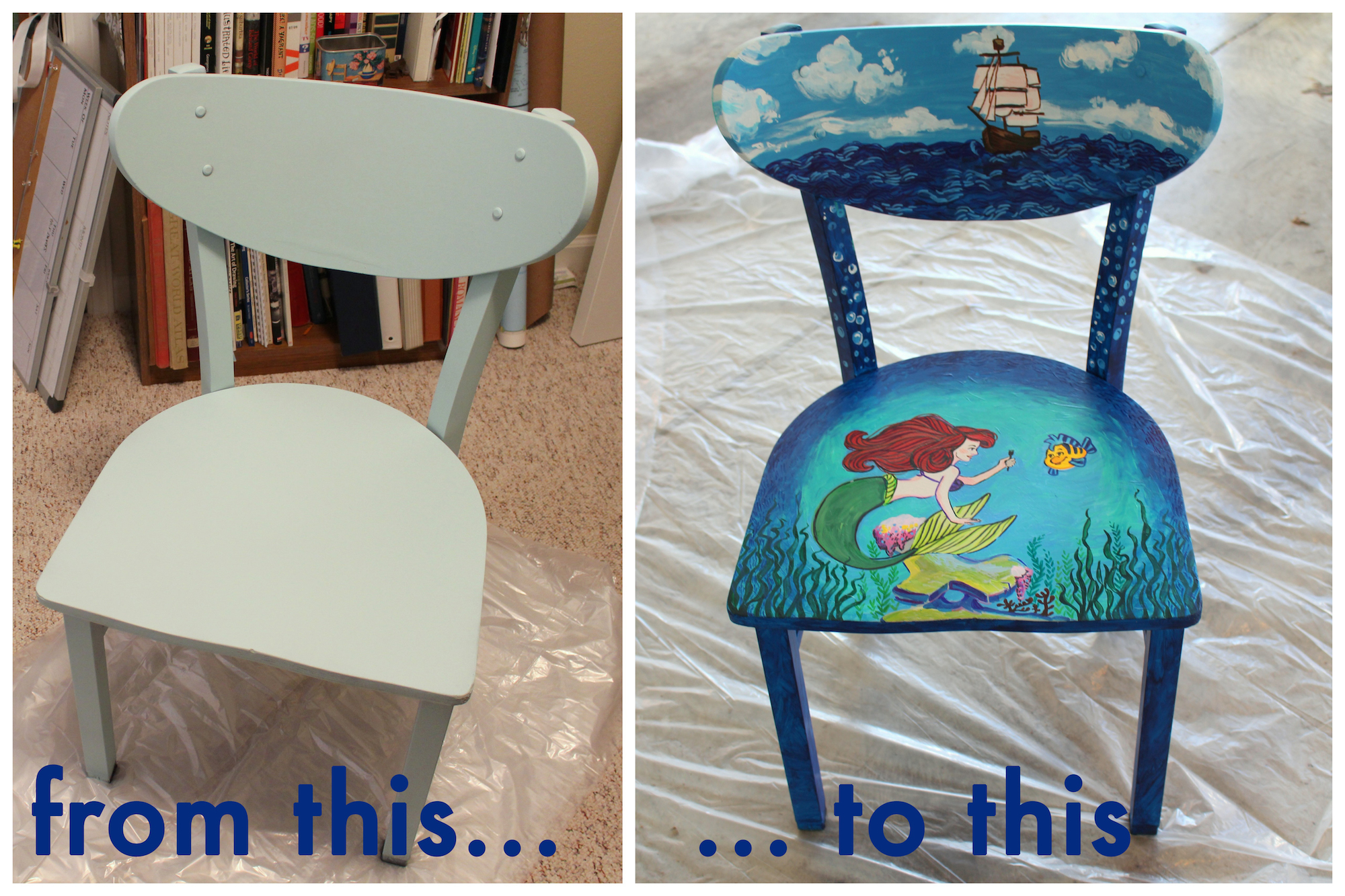
03.19.14 [little mermaid chair]
I suppose a blog on an artist website should have some process posts on how artworks are made. Here is my first trial on explaining the art-making process. If you like it, I'll make some more!
Tis neither magic nor elves.
Source: For This Journey We're On
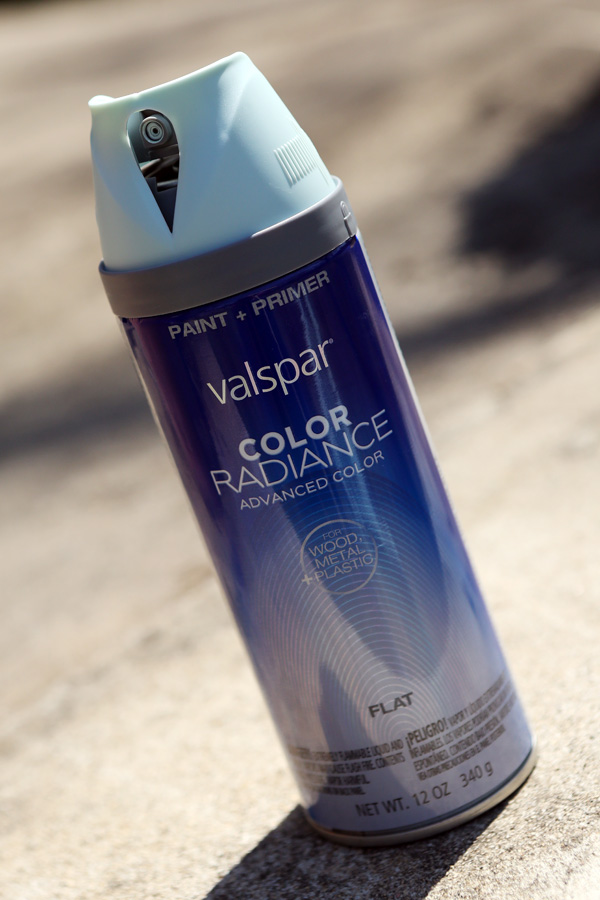
First, let's talk about the tools needed. I used Valspar Color Radiance paint and primer on the chair. The chair consisted of both wood and metal. It was previously used so it had some nicks here and there and a thin layer of lacquer on all of it. I sanded the entire chair prior to spraying, and then let loose with the spray paint. This brand worked out really well - it coated the chair evenly and primed it perfectly for the acrylic paints I planned to use on it. It's adequate for both wood and metal and was less than $4 a can from Lowe's.
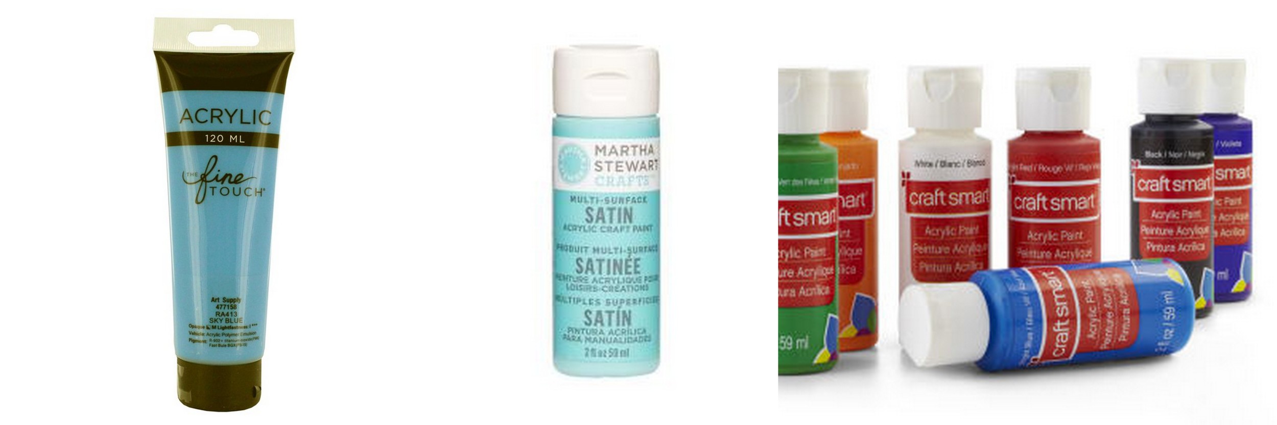
For most of the blocks of color on the chair (Ariel's tail, skin & hair, the waves and boat, Flounder) I used basic acrylic paints. The Fine Touch brand is from Hobby Lobby and, at about $3 a tube, it surprised me with how high-quality the paint ended up being. Speaking of high quality, Martha Stewart Craft Paints are my "special occasion" paints. At about $2 - $3 a bottle, 2.5 oz of paint is a precious commodity but money well spent. Only one layer of paint is needed because it's, like I mentioned, good quality. Keep that in mind when purchasing store-brand craft paints, like Craft Smart from Michael's. They practically give it away when it's on sale (therefore I stock up, because I'm a cheapo). Regular price, they're about a $1 a bottle; on sale they go down to as little as 50 cents. Unlike Martha's brand, these are mostly water with some pigment. They thicken up when you mix with other colors but - you get what you pay for. I used a Craft Smart yellow for Flounder's base and it took about 3 coatings to get it at the consistency I wanted.

Details, details, details.
You all have seen my drawings - I love me some details. Lots of little lines and crosshatching. To add these to paintings, I need water-based pens with fine tips. I use these for decorating canvas shoes, as well. (Remember when I did that? Good times.) Sharpie Stained pens are perfect for outlines, small lines and detailing. I used these for Ariel's face and outlines, for the contour lines on the waves of the sea, etc. The Graffiti fabric pens (multi-surface, if you ask me) worked wonderfully for shading and subtle color changes. I used these for a change of pigment in Ariel's skin, hue variation on her tail and hair, and for depth on the rock formation in the background. The markers I own are a nice variety of pastels and lighter hues so their addition doesn't make the color clunky at all, rather a nice gradation in the scene.
So here's the blank canvas I was working with. I did a preliminary sketch of Ariel & Flounder that I knew I wanted on the seat of the chair (the most traditional canvas area of the item). I didn't want to sketch directly on the chair because pencil pigment is often hard to rid from the final result. Attempting to erase it often adds to the problem (oh, the streaking.) So I start setting down blocks of color, starting with Ariel's tail and worked out from there.
That's Veronica Mars playing on one of the iPads. DUDE, THAT SHOW IS AMAZING. I WATCHED TWO SEASONS OF IT WHILE COMPLETING THIS CHAIR. YOU HAFTA WATCH IT, IT'S SO GOOD.
I mixed some different blues and teals for the background but it wasn't popping the way I wanted it to. I lightened it up with a very pale green and then used a dark blue around the edges so it looked as if she's in a cove. I should have taken a picture of Ariel without any outlines - it looked horrible. Never be too discouraged at the first inning of the game, everything will look terrible then. Outlines change everything. I framed the composition more with some seaweed, coral, and other sea flora and fauna. All of Flounder's details were done with paint pens. Paint pens are not cheating - just another tool to get the end result you desire. If you really want to sweat over details with a tiny, tiny brush, please be my guest and also my hero that I can only aspire to be like.
AH, HAVE YOU STARTED WATCHING VERONICA MARS YET, IT'S REALLY GOOD, I'M WATCHING IT AGAIN HERE
Now that the seat was done, I wasn't entirely sure what I wanted to do for the backrest. Then I thought, "THIS THING NEEDS A HORIZON LINE. WHAT IF SHE WAS UNDER THE SEA AND THEN YOU COULD SEE THE TOP OF THE SEA" and I had just found an awesome vintage photo of a ship when I was cruising 'round Pinterest the other day. FATE, MY FRIENDS.
I painted the base color of the sea and then set the ship on top of it rather than working around it from the get-go. My favorite thing to paint is clouds so I dabbed on some fluffy cumulus above the horizon. Details and shading were added thirdly with the paint pens. Lots of little lines on the waves because that's how I do. I added some bubbles on the back legs and across the support bars. Sometimes I get carried away with little details so I refrained from adding any to the legs, I kept those a loosely-painted blue.
You know I'm not gonna let a chance to do some lettering slip away. I looked over the lyrics for Under The Sea but, truthfully, the only fun ones are "Under The Sea, Under The Sea" which is fun to sing but not so much to look at. The rest of the song is about the horrible fates & ruts that befall sea life and humans. A morality tale in a fun Jamaican package. So I opted with Part of Your World - a phrase Ariel never even SINGS in that song. She sings "part of that world." Which is NOT the TITLE OF THE SONG. It frustrates me, man. I don't know why. Anyway, I laid down the letters with a paint pen (first attempt at spacing properly totally crashed and burned, you can see my attempt to hide up that shame just under "Your") and then went over with craft paint and a tiny, tiny brush. To give the lettering some depth, I used a dark red Graffiti pen and went over some parts of the letters so that it appears almost ribbon-like.

Ta-da! The finished product. It's a good idea to seal your work so that, should liquid or dirt get on it, it can be easily wiped off without damaging the work you've done. I used Rust-oleum Crystal Clear Enamel and it finished the chair very well. It's slightly glossy now, but not so much that taking a photograph will overexpose the colors used.
I guess I should mention why I even did this. The mayor of St. Charles, Sally Faith, is having a charitable nautical-themed ball to raise money for local charities. My chair, along with three other chairs decorated by local artists, will be put up for auction. My original idea was to do a letter-centric chair around the lyrics of "Beyond The Sea" by Bobby Darin. When tossing this idea around with Jacob, my husband suggested Ariel or Nemo instead. I LOVE ARIEL. I wish I had thought of it. But that's why I married him, for super suggestions like that. I hope someone buys it for their daughter or granddaughter and it makes them very happy.
So that's that. Interested in other processes or want to know how I make something? Comment below and I'll do another one. This was fun, thanks for reading. Peace out, girl scout.